10 Steps to Better Mobile Donation Forms

The future is now. In 2020, some studies showed that mobile website traffic surpassed desktop traffic. Hopefully, your donation form is already mobile-friendly, but here are 10 tips to make it mobile-friendlier from online fundraising pros :
- Eliminate all unnecessary/nice-to-have fields.
- Title, Middle Name, Suffix, Comments – get rid of them all! This tip will likely improve the completion rate on your desktop forms too. Also, save Matching Gift information for the Thank You page if you can.
- Use tappable buttons for giving levels.
- Radio buttons are hard to tap on mobile and open input fields are also difficult to use. We recommend using large, tappable buttons (46px minimum) that have a very clear “on” or “selected” state for your mobile donors.

- Radio buttons are hard to tap on mobile and open input fields are also difficult to use. We recommend using large, tappable buttons (46px minimum) that have a very clear “on” or “selected” state for your mobile donors.
- Limit text that displays above the form
- You definitely want to include some messaging to thank your donors and express the value of their donation but keep it short and sweet so they don’t think they need to click again to start the donation process.
- Display labels for each field above the field
- Sometimes designers like to get fancy with forms and put the field labels below the fields or even inside the fields. I recommend saving the fanciness for other areas and keeping the forms simple with the labels just above each field. This is ideal for accessibility as well.
- Check your error text
- Submit an incomplete form on mobile to ensure your error text is visible.
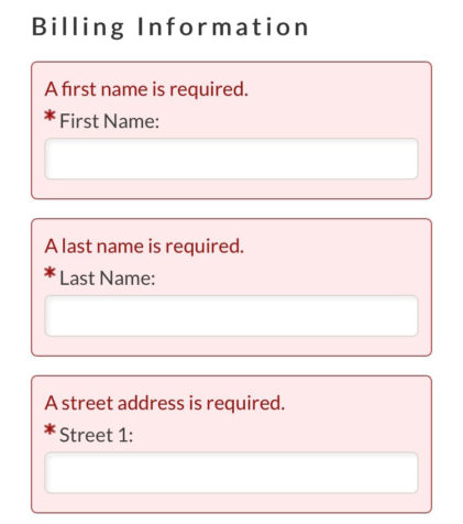
- Submit an incomplete form on mobile to ensure your error text is visible.
- Indicate which fields are required
- Error correction is never awesome on a phone so to prevent errors from occurring, you should use an asterisk to indicate which fields are required.
- Use autocomplete tags within the form fields
- Anytime we can take advantage of shorter completion times for donation forms, we should. Adding autocomplete values to your form fields allows your donors to quickly populate contact information and even credit card information, saving them time and typing.
- Ensure the correct input type is used to display the right keyboard
- Each form field has an input type that tells your phone which keyboard to use. When you ask for a donor’s email address, make sure the input type is “email” so their phone will display the keyboard with the @ sign.
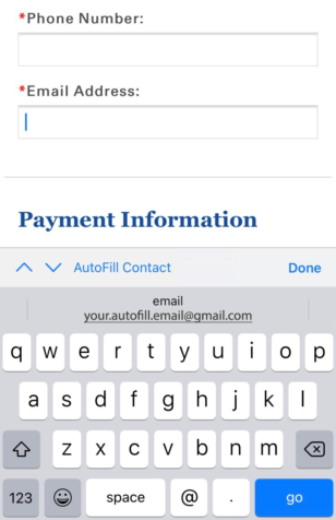
- Each form field has an input type that tells your phone which keyboard to use. When you ask for a donor’s email address, make sure the input type is “email” so their phone will display the keyboard with the @ sign.
- Re-iterate the donation amount on the Submit button
- Since your donors are likely to have to scroll down to complete your form, be sure to state the donation amount again at the bottom. This is a nice checkpoint for your donors to be sure they selected the correct amount.
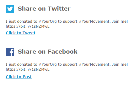
- Use click to share links on the Thank You page
- Just after donating is a prime time to encourage your donors to share their support. Use your Thank You page to provide easy-to-share posts.
- Just after donating is a prime time to encourage your donors to share their support. Use your Thank You page to provide easy-to-share posts.
What did I miss? Please share some other ideas for how to make donation forms mobile-friendlier in the comments below!