Three Simple Ways to Improve Your Online Fundraising
It’s 2013. As a nonprofit focused on online fundraising, you’ve likely started making resolutions to improve, diversify or broaden your fundraising efforts. As you plan or refine your fundraising strategy, I challenge you to consider these three simple changes to improve the results of your online giving!
And don’t fret. These tips are easy and completely doable without a ton of time or website expertise.
Sure, you could expand on each of these and really revolutionize your online efforts, but let’s start small. You likely have enough on your plate as you move into a new year with new goals, commitments, resolutions and expectations.
First off, let’s set a deadline. By March 31st, make these three changes to your key online fundraising pages and report back with your findings. We’d love to hear how things went!
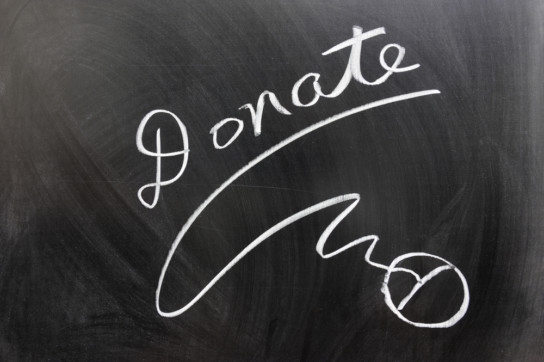
1. Add a CLEAR, DIRECTIVE ASK on your homepage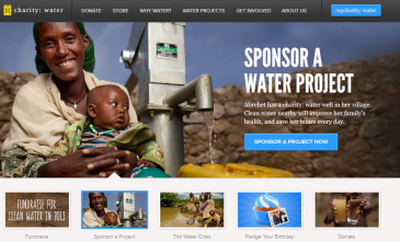
As a nonprofit, your number one reason for professional (and sometimes personal) existence is to serve your mission. You work toward it every day, in everything you do, and in every form of communication you make. You educate, you inform, you advocate, you serve, you share. And you ASK for help.
At the risk of sounding like Captain Obvious, getting the help you need starts with something very simple. The ASK. But, are you doing it with as much purpose and clarity online as you are in person?
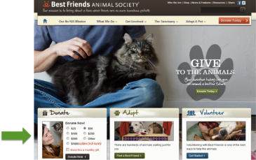
First off, your website is used to engage…to draw people in. Nonprofits often use rich, engaging imagery that pulls on the heartstrings and connects with your users. If fundraising is a top priority for you, make SURE you’re capitalizing on their attention by putting an online fundraising ASK in the imagery they’re drawn to!
A simple “Donate now”, “Give to a Child in need” or “Support us” call to action placed within an engaging image on your homepage will not only draw someone in, but will make them much more likely to take the action you want them to take.
2. Remove obstacles to action
47% of people who visit a website intending to make an online donation give up before completing the process (source)
With this in mind, it’s important to understand that people are busy! Even if they’ve already decided to donate to your organization, they may not actually complete the transaction before being called away by a work interruption, meeting, phone call or worse yet, frustration.
 So make it EASY on them. Include as FEW fields in the online giving form as humanly possible. Would you like to know their full biographical history, demographics and life story with their first gift? Sure. But leave those questions for the follow up.
Make sure online giving is simple and that their full transaction is one click away. When they click “donate,” they should be able to make their full transaction on the very next page.
Just last week I clicked to donate to a nonprofit and first was taken to a page that described all of the giving options I had (planned giving, online gift, check, download PDF form, etc.). Three clicks (and lots of reading) later I was being asked what credit card I wanted to use and I just gave up. Don’t let this happen to you! Keep it quick and simple and you’ll lose less donors.
3. Perform a simple A/B test.
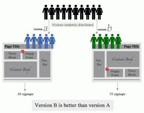
A/B testing is comparing two (or more) variations of the same content determine which one performs better. Check out this article from Smashing Magazine (they get credit for the image too) to learn more details about A/B testing.
Google has made it easy for nonprofits to test and analyze their own website content through content experiments, which allows you to make small changes to content on your website, see which one performs better, then make the more successful option permanent. It’s that simple. Here are some ideas to get you started:
- Giving terms: Try testing online fundraising elements like your donate button. Use “donate”, “give” and “support” to see which performs best? Or even better, assign a tangible to the gift and test “Donate now” against “provide a meal to a family today” to see if the tangible element inspires more action
- Colors: Try two different colors for your donation button on your homepage. You’ll be surprised at how much it may affect click rates.
- Add the Why: Try adding a quick blurb about how donations are spent or your current funding priorities above the same donation button to see if it’s inspires more clicks!
So tell us, what are your fundraising plans, questions or concerns around these tips? We could all benefit from hearing your fundraising improvement stories, so please post below!