Google Analytics for Nonprofits – Part 1
This post is the first in a monthly series about Google Analytics. As we proceed, I’ll share tips on how you can use this tool to gain more insight into your online marketing. I’ll start off with the basics, but then we’ll get into some advanced techniques.
If you’re not yet familiar with Google Analytics, it’s a free tool from Google that you can add to your site to give you information about how people are coming to your website and how they behave when they get there.
Most clients I’ve talked to have Google Analytics installed, but aren’t always sure how to use it effectively. Today I’ll cover one of the most useful graphs in the whole tool (which happens to be right on the dashboard you see on the first page of the reports) and I’ll give you tips on interpreting some of the most common metrics you see in this tool.
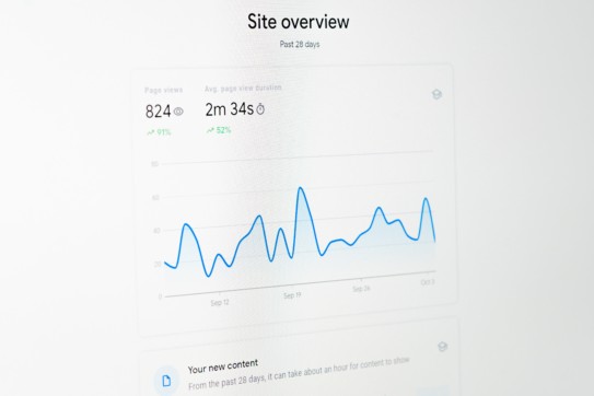
The main graph on the dashboard looks simple enough, but it can give you a great overview of what’s going on with your website.
In the top right corner you can adjust your date range, and right below that you can change the graph to display by week or month. If your traffic follows a weekly pattern with spikes or dips around weekends and you want to look at a longer timeframe, it might be easier to spot trends by graphing by week rather than day. You can also compare one date range to another right on this graph. In the example below, you can see visits by week for the past year, compared to the same time period in the prior year.
Additionally, you can change what data you’re graphing (or even look at 2 metrics on the same graph). You can look at
- Visits – This is different than unique visitors. If a person comes to your site 4 times in the time period you’re looking at, they will add 4 visits to your count. The visits metric is useful to see how well your online & offline campaigns are driving traffic to your website (more visits is almost always a good thing), but doesn’t tell you how your website is performing. Just because they arrive at your site doesn’t mean they found what they were looking for or had a good experience.
- Pageviews – I recommend avoiding this metric. If you see your pageviews go up, that could be because you had more visits that day or because each visitor viewed more pages. You’ll have to look at the visits & pages/visit data to determine which metric changed.
- Pages/visit – This is the total number of pageviews divided by the total number of visits, giving you an understanding of how much the average visitor is interacting with your site. What is a good benchmark? It depends.
- If your main goal is to share information with visitors, you want a higher number of pages per visit.
- If you send out an email asking for donations in response to an emergency, a productive visit might just include a view of the donation page and a view of the confirmation page. So, in that case a sharp decline in pages/visit would be natural.
- If you’ve gotten feedback that your website is hard to navigate and you work to make the architecture more intuitive, you might want to see this figure go down. This is especially true if you want people to go to a physical location (a blood drive, for example). You might want visitors to be able to quickly get to the hours & locations & then leave the site to go to the location.
- Avg. time on site – This tends to trend closely with pages/visit. Try graphing this along with pages/visit. If someone looks at more pages, they are probably on your site for longer, but this is not always the case. For example, a popular video on your site might cause people to stay on one page for much longer. If you see this metric moving in a different direction from pages/visit, look at the types of content you have to see why.
- Bounce rate – This is the percentage of visits that leave after viewing only the page they entered on (they land on your site and bounce right off, rather than sticking around). This is a very important metric for judging the first impression that your website gives and the quality of traffic you are getting. A lower bounce rate is almost always better.
- If you make a major change to your homepage (or any page of your site that people enter on) and see the bounce rate go up, that change was likely not beneficial.
- Visitors from an online campaign are always more likely to bounce than visitors that typed in your URL. However, if you have a new campaign that drastically increases your bounce rate, your campaign messaging might not be driving the right people.
- If you are driving people to a 3rd party site or if you have subdomains that you are not tracking, you will see an inflated bounce rate. For example, if you are driving people to your twitter page, you would likely not be tracking that through Google Analytics, and therefore that visit would look like a bounce. (This can be tracked, but that’s a topic for another post). Check to see if there are paths you want people to follow that are not tracked before you panic.
- % new visits – Google Analytics sets a cookie on the visitor’s browser when they come to your site. If they come back on the same computer, with the same browser, without deleting their cookies, they will be counted as a return visitor. However, if they visit from a different computer or if they clear their cookies, they will look like a new visitor. This metric can be useful, but do take it with a grain of salt.
That’s a lot of great insight into your data, and we haven’t even gotten through the whole dashboard yet! Stay tuned next month for how to dig a bit deeper into your data.
Update: Read more about your visitors in Intro to Google Analytics #2 and Intro to Google Analytics #3