7 Tips for Successful Online Fundraising
The folks at Epic Change continue to do great things using the web as their medium. On mothers day 2010 they set out to raise money for Mama Lucy – a change maker who’s dedicated her life to helping kids in Arusha, Tanzania. We can learn some things from this online fundraising project.
Their seven day online initiative, called “To Mama with Love” focused on “creating a collaborative online art project that honors thousands of moms across the globe and simultaneously raises funds to invest in a remarkable mom who’s changing the world.” said Stacey Monk, founder of Epic Change. As of today they’ve raised over 16 thousand dollars and helped 16 kids get into school and honored over 300 moms in the process.
I’d like to use this project as a learning tool for how to do successful fundraising online. Online Fundraising can be tricky, but if you if you follow the 7 tips below I’m confident you’ll reap the rewards.
Design it right
The goal of To Mama with Love is to honor moms around the world while also raising money to support a project in Tanzania. The design of this site does a very nice job communicating what the project is all about in a visual perspective. If you spend a minute or so on the home page you’ll notice the interactive map and the hearts popping up. Each Heart that pops up represents a mother who’s been honored while also showing where the donation came from in the world. You’ll also notice how much the project has raised in the top right corner. Their focus is narrow and they’re doing a great job communicating it visually all over the site. Don’t forget that design matters!
Action: Go look at your website. Does the design visually communicate the purpose of your project?
Show off the cause
While www.tomamawithlove.org does a great job visually communicating the intent of the project Epic Change didn’t stop there. At the very top of the home page the purpose of the project is written clearly for all to read. It’s not hard to figure out what To Mama with Love is all about. Couple this clear statement with great design and they’ve immediately given visitors confidence in the work their doing. If someone still isn’t convinced and wants to dig in to ensure their gift and support is going to a worthy cause they can go to the “more info” button found in the right column.
Action: Find out if you clearly and briefly communicate the project vision on your web site for everyone to see.
Have a clear call to action
Marketers and fundraisers alike know that having a visible and simple “call-to-action” is an incredibly important piece of any communication. Your web site is no different. By having a call-to-cation you allow people to see what they should do. Without one you loose all possibility of inspiring the action you’d like people to take.
Action: Ensure you have a call-to-action that is easily seen and simple to understand on every page.
Share your goal and demonstrate impact in real time
I love how this project has it’s goals front and center. In the top right section of the home page you can see the goal of raising $50,000 as well as information on how much they have raised to date ($14,280) and how many moms have been honored (307).
Seeing the goals and the impact does two things. First, it helps website visitors further understand what the project is all about by seeing real data. Second, it allows visitors to connect with the fundraising efforts on a deeper level. By seeing the impact people start thinking “wow, that’s amazing … I think I can help here!”.
Action: Check to see that your website tells people what your goals are and where you stand in relation to achieving them.
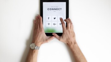
Make it simple to share
This site is littered with ways to share. From the ReTweet and Facebook share buttons to the Twitter and Facebook love sections people, with the click of a button, can share their excitement about the project and how they’ve helped.
Making your content shareable in a simple way helps your project spread through the social web so your message reaches further.
Action: Evaluate your current website. Is it simple to share things as a visitor? What if it’s the first time I’ve visited the site? Still simple to share?
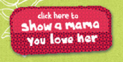
Make it portable
The creators of To Mama with Love had a simple and portable badge (seen left) designed that is easily put on blogs and websites around the web – all you have to do it insert some basic HTML (see how here). The idea being that anyone who supports the project could show their support by putting the badge up on their website or blog.
The second thing the creators of To Mama with Love did was create a twibbon. This application allows you to promote awareness of your cause on Twitter by overlaying a small icon onto your supporters’ profile images to create a ‘Twibbon’. By doing this To Mama with Love has over 300 supporters showing their support on Twitter every time they “tweet” out a message into the twittervers.
Action: Evaluate the portability of your online fundraising project? Is it simple for your supporters to show their support on their blogs or Twitter? What about Facebook?
Don’t forget email
Email is key to long term engagement and extremely valuable when taking the next step in showing your supporters how the money has been used.
Action: Don’t forget to make it simple to sign up for email updates on your web site.
Conclusion
Online fundraising isn’t as simple as putting up a donation form any more. You have to be more creative than that. What have you seen from the above that you can put into practice today?